Size-specific adjustments to type designs
An investigation of the principles guiding the design of optical sizes
Purpose of the book Quotes Table of contents Featured typefaces Order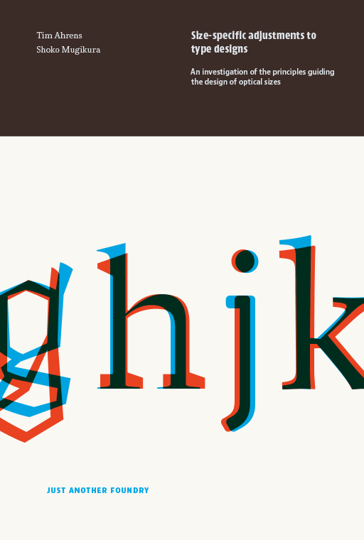
This book is currently out of print.
If you wish to receive a notification in case a reprint or a revised edition becomes available, please send a message to:askme@justanotherfoundry.com
Purpose of the book
The aim of this book is to determine principles underlying the design of optical sizes, with a view to giving useful advice to practitioners who wish to design such sizes for their own fonts.
What are optical sizes?
“Optical sizes” are size-specific adjustments to type designs. They were practiced for 500 years of metal type printing. Since punches had to be cut separately for each type size, adjusting them accordingly did not involve any additional effort and the optical compensations were built into the fonts. Characters intended for use in small sizes typically show an increased width and x-height, reduced stroke contrast and looser spacing.
In phototype, size-specific adjustments were largely given up and single-master designs dominated. This practice was continued during the early years of digital type.
ATF Garamond, from left to right: 6, 8, 10, 12, 14, 16, 18, 24, 72 pt
Why we wrote this book
From the metal type era, hardly any documentation on the subject is available since punchcutting, like other crafts, was not discussed much in writing. The skills and insights were passed on from one master to the next by demonstration. Even today the design process of optically sized typefaces has rarely been recorded or analysed. This lack of resource lead Tim Ahrens to research and write about it himself in 2007, in the hope that the outcome would become a useful source for practitioners who wish to create fonts with size specific styles.
Features of this book
The book looks into type history and perception psychology, and analyses designs by old masters and numerous contemporary designers. We interviewed a number of designers such as Robert Slimbach, David Berlow, Akira Kobayashi, and Christian Schwartz. Their answers, along with the analysis of existing fonts, form an important basis for the principles explained in the book.

The most extensive section, “Design advice”, gives comprehensive guidance to size specific designs based on interviews with contemporary designers as well as our analysis on contemporary and old masters.
The type specimen section shows various metal and digital designs. It includes the authors’ comments on each typeface and provides cross-references to other designs and the relevant principles in the main part of the book.
About the new edition
The original version of this paper was written as part of Tim Ahrens’ MA in Typeface Design at the University of Reading in 2007. The following year, it was published by Mark Batty Publisher. This first edition was produced as print-on-demand, which regrettably resulted in a very high unit price and restricted production quality. In 2013 we obtained the publishing rights and, since we have been constantly receiving requests for the book, decided to update, extend, and re-publish it ourselves.
This 2014 edition is co-authored by Shoko Mugikura, who joined extending and updating the content and designed the book.
For more about the difference from the previous edition read our blog entry.
Sample sections on Suppression and emphasis of features in typeface design and on Spatial frequencies can also be found on our blog.
Quotes
“As technology for rendering text on screen evolves, and the dream of dynamic optical scaling on the OS or browser level finally comes true, this book will be an important guide for preparing typefaces that will take advantage of this in an informed and deliberate way. Future generations of type designers are very lucky to have a resource like this book, rather than having to cobble together the knowledge wherever they can find it.”
“It is reassuring to look through the wide variety of approaches to optical scaling shown in specimens in the final section, and see that there isn’t one perfect solution that we’re all working towards, but rather a range of correct answers, each appropriate to its own situation and technological limitations.”
from the foreword by Christian Schwartz
“Despite the specialized topic, this stuff is valuable even to those who will never sketch a letter or fire up a font editor. Those who choose and use type in any capacity will benefit from what this book has to offer. In discovering the ways that type can be optimized for specific applications, readers will learn a lot more about variations in lettershape, stroke contrast, proportions, and spacing than nearly any other text can teach.” →
“While this book is aimed more towards type designers, the material fills in a lot of the gaps in practice for typographers quite nicely too. […] This is an insightful read behind the tools designers make (and use) everyday, and not to be missed.” →
“This is not just the best, but really the only significant work on this intriguing and complex topic. Highly recommended for intermediate and advanced type designers, and anyone else interested!” →
Thomas Phinney on the FontLab blog
Table of contents
Notes on this edition
Foreword
1 Introduction
2 Reasons for size-specific adjustments
Technological restrictions / Legibility and visual consistency / Purpose-specific designs / The situation today
3 Goals, methods, and structure of this book
3.1 Objective of this book
3.2 Research methods
History / Perception psychology / Concrete statements made by designers and writers / Analysis of existing fonts
4 History
4.1 Metal types
Hand punchcutting / The role of the punchcutter / Machine punchcutting / Ink spread / What is the “true” shape?
4.2 Phototypesetting
4.3 Digital fonts
Digital typesetting / Pixel fonts and hinting / Post-pixel screen typography
5 Perception psychology and reading research
The reduction phenomenon / Acuity of human vision / Spatial frequencies / Frequency channels / Adaptation / Crowding
6 Design advice
6.1 Letter shapes
Weight / Stroke contrast / Width / Vertical proportions / Counters / Suppression and emphasis of features / Serifs / Joins / Sans serifs / Large sizes
6.2 Spacing
6.3 Progression of shape
Order in which the masters are designed / Number of necessary masters / Interpolation as a design tool
7 Alternatives to optical sizes
Making a compromise / Accepting chunkiness in large sizes / Adding refined detail to robust general shapes / Using different designs altogether / Conclusion
8 Summary and outlook
9 Type specimens
10 Questionnaire
Bibliography
Featured typefaces
List of typefaces featured in the specimen section
Metal typefaces are shown in italic
Abril, José Scaglione, Veronika Burian – Type Together
Alida, Hubert Jocham – Hubert Jocham
Arlt, Alejandro Lo Celso – PampaType
Arnhem, Fred Smeijers – OurType
Arno, Robert Slimbach – Adobe
Baskerville (ATF)
Baskerville (Monotype), under the direction of Stanley Morison
Baskerville Original, František Štorm, Otakar Karlas – Storm Type Foundry
Bembo (Monotype), under the direction of Stanley Morison
Benton Modern, Dyana Weissman, Richard Lipton – Font Bureau
Benton Sans, Font Bureau studio, Tobias Frere-Jones, Cyrus Highsmith; Based on Morris Fuller Benton – Font Bureau
Beorcana, Carl Crossgrove – Terrestrial Design
Berling Nova, Örjan Nordling, Karl Erik Forsberg – Linotype
Bodoni (ATF), Morris F. Benton
Bodoni (ITC), Sumner Stone with Janice Prescott Fishman, Holly Goldsmith, Jim Parkinson; Based on Giambattista Bodoni – ITC
Brandon Grotesque/Text, Hannes von Döhren – HvD Fonts
Brioso, Robert Slimbach – Adobe
Brunel, Paul Barnes and Christian Schwartz – Schwartzco Inc.
Caslon (H. W. Caslon), William Caslon
Caslon (Monotype)
FF Celeste, Chris Burke – FontFont
Chaparral, Carol Twombly – Adobe
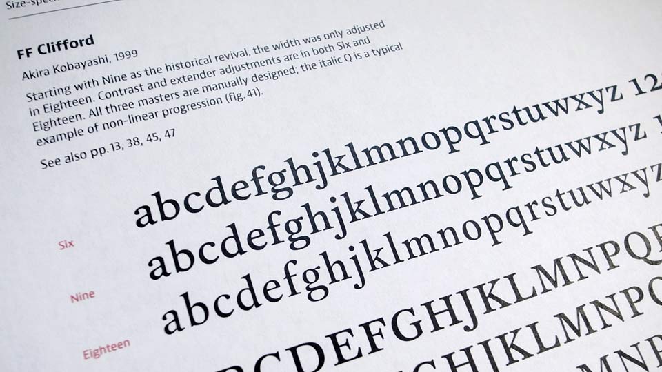
FF Clifford, Akira Kobayashi – FontFont
Computer Modern, Donald Knuth and others
Condensed Sans Series No.37 (Stephenson Blake)
Coranto 2, Gerard Unger – Type Together
Cycles, Sumner Stone – Stone Type Foundry
ARS Descendiaan, Angus R. Shamal – ARS Type
HTF Didot, Jonathan Hoefler – Hoefler & Co.
Domaine, Kris Sowersby – Klim Type Foundry
Ehrhard (Monotype), under the direction of Stanley Morison
Eldorado (Font Bureau), David Berlow, Jane Patterson, Tobias Frere-Jones, Tom Rickner; based on Jacques de Sanlecque the elderth century, William Addison Dwiggins – Font Bureau
Escrow, Cyrus Highsmith – Font Bureau
Fakir, Bas Jacobs, Akiem Helmling, Sami Kortemäki – Underware
Farnham, Christian Schwartz – Font Bureau
Fayon, Peter Mohr – OurType
DTL Fleischmann, Erhard Kaiser; based on Johann Michael Fleischmann – Dutch Type Library
Fleischmann (Enschedé), Johann Michael Fleischmann
Founders Grotesk and Text, Kris Sowersby – Klim Type Foundry
Franklin Gothic (ATF), Morris F. Benton
Freight, Joshua Darden – Darden Studio
Garamond (original type from the Berner Specimen), Claude Garamond
Garamond Premier, Robert Slimbach – Adobe
Garamond (ATF), Morris F. Benton
Garamond (Monotype), Stanley Morison
Garamond (Stempel)
Geo, Alexei Vanyashin – Alexei Vanyashin
Gill Sans (Monotype), Eric Gill
Giorgio, Christian Schwartz – Commercial Type
Glosa, Dino dos Santos – DSType Foundry
Greta, Peter Biľak – Typotheque
Guardian Egyptian, Paul Barnes, Christian Schwartz – Commercial Type
Guardian Sans, Paul Barnes and Christian Schwartz – Commercial Type
Harriet Series, Jackson Cavanaugh – Okay Type
Houston, Christian Schwartz – Font Bureau
Ibis Text and Display, Cyrus Highsmith – Font Bureau
Imprint (Monotype)
FF Info Text and Display, Erik Spiekermann, Ole Schäfer, MetaDesign – FontFont
Jannon, Jean Jannon, František Štorm – Storm Type Foundry
FF Karbid, Verena Gerlach – FontFont
JAF Lapture, Tim Ahrens; based on the Leipziger Antiqua by Albert Kapr – Just Another Foundry
Le Monde Livre, Jean François Porchez – Typofonderie
Lutetia (Enschedé), Jan van Krimpen, cut by Paul H. Rädisch
Lutetia (Monotype), Jan van Krimpen
Lyon, Kai Bernau – Commercial Type
ARS Maquette, Angus R. Shamal – ARS Type
Mencken, Jean François Porchez – Typofonderie
FF Meta, Book by Erik Spiekermann; Headline by Erik Spiekermann, Christian Schwartz, Joshua Darden – FontFont
Miller, Matthew Carter, Tobias Frere-Jones, Cyrus Highsmith – Font Bureau
Minion, Robert Slimbach – Adobe
Minuscule, Thomas Huot-Marchand – 256tm
Mommie, Hubert Jocham – Hubert Jocham
Neue Haas Grotesk, Christian Schwartz – Font Bureau
ITC New Esprit, Jovica Veljovic – ITC
Nimrod, Robin Nicholas – Monotype
ITC Officina Sans, Erik Spiekermann – ITC
Palatino (Stempel), Hermann Zapf
Plantin (Monotype), under the direction of F. H. Pierpont
Poynter Oldstyle, Tobias Frere-Jones – Font Bureau
PT Sans, Alexandra Korolkova, Olga Umpeleva, and Vladimir Yefimov – ParaType
PT Serif, Alexandra Korolkova, Olga Umpeleva, and Vladimir Yefimov – ParaType
Publico, Ross Milne, Christian Schwartz, Paul Barnes, and Kai Bernau – Commercial Type
Pyke, Sofie Beier – Sofie Beier
ReDisturbed, Jeremy Tankard – Jeremy Tankard Typography
PF Regal, Panos Vassiliou – Parachute
Rialto, Giovanni Da Faccio, Lui Karner – dfTYPE
Romanée (Enschedé), Jan van Krimpen, cut by Paul H. Rädisch
Romulus (Enschedé), Jan van Krimpen, cut by Paul H. Rädisch
Rumba, Laura Meseguer – Type-Ø-Tones
Sanvito, Robert Slimbach – Adobe
Satyr & Faunus, Sindre Bremnes – Monokrom
Sirenne, Alan Dague-Greene – MVB Fonts
Sitka, Matthew Carter – Microsoft
Spectrum (Enschedé), Jan van Krimpen
Taz, Lucas de Grootpresent – LucasFonts
Tiempos, Kris Sowersby – Klim Type Foundry
Times New Roman (Monotype), Stanley Morison, Victor Lardent; based on William Starling Burgess
Tramuntana, Ricardo Santos – Tiponautas
URW Antiqua, Hermann Zapf
URW Grotesk, Hermann Zapf
Vincent, Matthew Carter – custom font for Newsweek
Walbaum 2010, František Štorm – Storm Type Foundry
Wilhelm-Klingspor-Gotisch (Stempel), Rudolf Koch
Ysobel, Robin Nicholas – Monotype
Zocalo, Cyrus Highsmith – Font Bureau
Initially we intended to include all new designs published since 2008. After setting specimen pages and examining them, however, we came to the conclusion that showing a selection of typefaces would be more purposeful for this publication.
We only included typefaces that follow an unconventional approach in terms of optical sizing or show unusual or unique techniques and treatments of the sizes.
This is not to be interpreted as a judgement of quality of the designs. In fact, some of the families we omitted – most notably Modern roman typefaces, the largest category of optically sized fonts – are very good designs with sensible size-specific adjustments.
We would like to thank all foundries and designers who generously provided their fonts for us to try and use.
Order
Specifications
• Title: Size-specific adjustments to type designs – An investigation of the principles guiding the design of optical sizes
• Authors: Tim Ahrens and Shoko Mugikura
• Published by: Just Another Foundry
• Format: 200 × 300 mm
• 192 pages
• Printing: offset, 2-colour
• Binding: OTA binding
• ISBN: 978-3-00-045937-5
This book is currently out of print.
If you wish to receive a notification in case a reprint or a revised edition becomes available, please send a message to:askme@justanotherfoundry.com